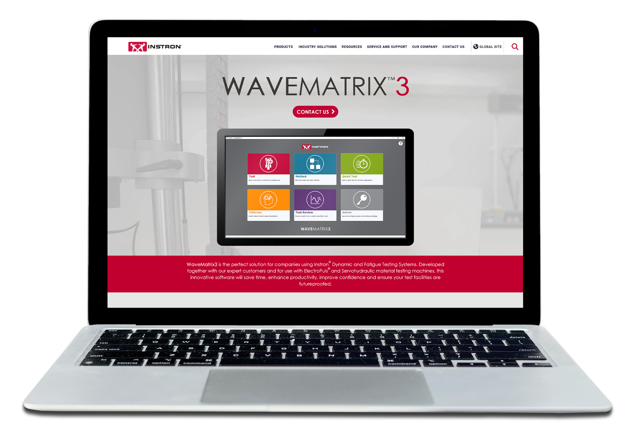
Whilst working with materials testing giants, Instron, we were given the task of promoting the new WaveMatrix3 software; an upgrade to the previous version released 4 years prior.
Not only would it require the usual brochure, datasheet and webpage, it needed a richer social media engagement via Instagram, Facebook, LinkedIn and Youtube to further the campaign's international reach.
Creating a new look and feel just for the campaign was key, whilst ensuring it still matched the original Instron branding.
UX Design
The new software introduced cutting-edge technology which needed to be front and center of not only the campaign, but the program itself.
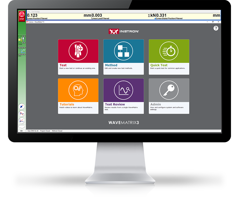
I was asked to review the homepage and come up with new ideas that would bring the new software in-line with other products, whilst customising the layout to fit the product and make it user friendly.
I generated 6 layout ideas of which option 4 was chosen: a compromise on a relatable look and feel whilst introducing the new buttons into the mix.

Artwork Style
The Instron brand encourages simplicity in its look and feel. It features a simple colour palette of red, dark grey and white, and encourages a use of white space with vector icons to aid the viewier.
Whilst we always want to respect the brand guidelines, we also wanted to make this campaign unique to the product to make it stand out and inspire higher engagement.
These ideas would need to be applied to both an animated social media campaign and a series of promotional videos.
For the animated social media campaign, we wanted to create simple, short, attention grabbing visuals which would generate viewers to complete the call-to-action.
I took the original geometric background pattern that was familiar to the previous version of the software and incorporated it into our animations but with a strong red overlay that would stop scrollers in their tracks.
This gained a familiarity with those who would be upgrading their software, and when combined with the simple iconography, fonts and logo, aligned perfectly with the brand.

Social Media
DESIGN IDEASA few experiments were tried and tested to see what would be more effective. A combination of ideas were settled upon before we proceeded with the messaging.
The icons were thought about in great detail as they needed to efficiently illustrate the topic for each animation.
Finally, the animation would end as it started; on a moving visual of the logo, before seamlessly looping back to the start.
A series of four teaser animations were initially released for the Coming Soon campaign, which asked viewers to visit a page to register their interest in the upcoming product.
The 'questions' that were posed in the Coming Soon campaign messaging were then answered in the series of Launch animations that came soon after. These were all released on Instron's social platforms such as Facebook, LinkedIn and Instagram.
Because Instron has a global customer base, we wanted to ensure everyone was catered for, and so the animations, webpage and emailers were translated into several languages.
Storyboards
It can be tricky when you need to tell a story about something you are not an expert in. Luckily, I had access to a team of engineers who very kindly provided their knowledge and walked me through the software so I could better understand its features and what the most important parts were in order to highlight these for a potential customer.
I created a detailed storyboard for each promotional video: an important feature being explained in each one. Each one was reviewed by both engineers for technical clarity, and by the marketing manage for ensuring our message was on point.
These became my map as I navigated rebuilding the software screens in vector format inside Adobe Illustrator. Doing so allowed me to not only adjust the page to fit in text panels, but also to be able to zoom into parts of the page with no worry of losing image quality.
Launch Videos
With ability to animate any element of the software, it allowed me to add motion where it would have otherwise been static, prevented the video looking like a basic screencapture, and add animations to the icon buttons to highlight a certain area.
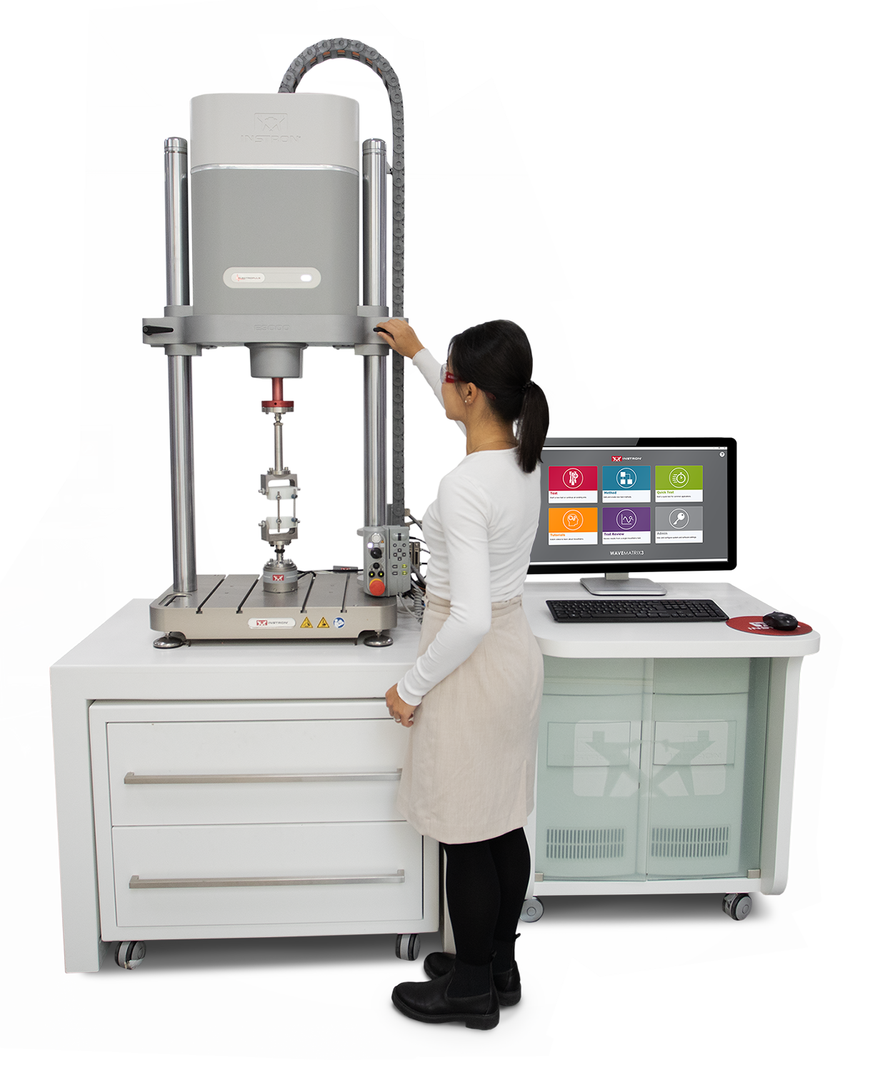
I was also pleased to be able to shoot and direct my own live footage for the main combination video featured at the top of this page. This was done to add an extra human element which sometimes we miss out on when discussing a software product.
To view each of the initial launch videos, please select your chosen topic below.
The Result
I'm pleased to announce the excellent statistics as a result of the WaveMatrix3 promotional campaign!

Marc Overson, Global Product Marketing Manager at Instron