PitPat Campaign
CREATIVE CONCEPTS
Role: Designer
THE BRIEF
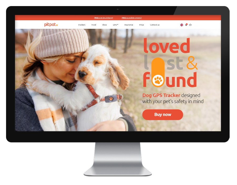
The challenge was set to produce a brand campaign that promotes PitPat's dog tracker by bringing to life the tagline “Loved lost and Found”.
This needed to be effectively applied across different platforms including print and digital. The emotional but functional appeal to pet owners needs to be considered at all times.
The design should communicate PitPat’s values: that PitPat know and care about dogs, genuinely love dogs, and as a result, go the extra mile for their customers.
THE AUDIENCE
The target audience – whilst clearly dog owners – also needs to be owners of smartphones so that they can use the PitPat App, which is still a fairly large demographic in today’s society.
Regardless, it is absolutely necessary to emphasise the emotional connection between pets and their owners, whilst still highlighting PitPat’s role in keeping pets safe.
THE BRAND STYLE
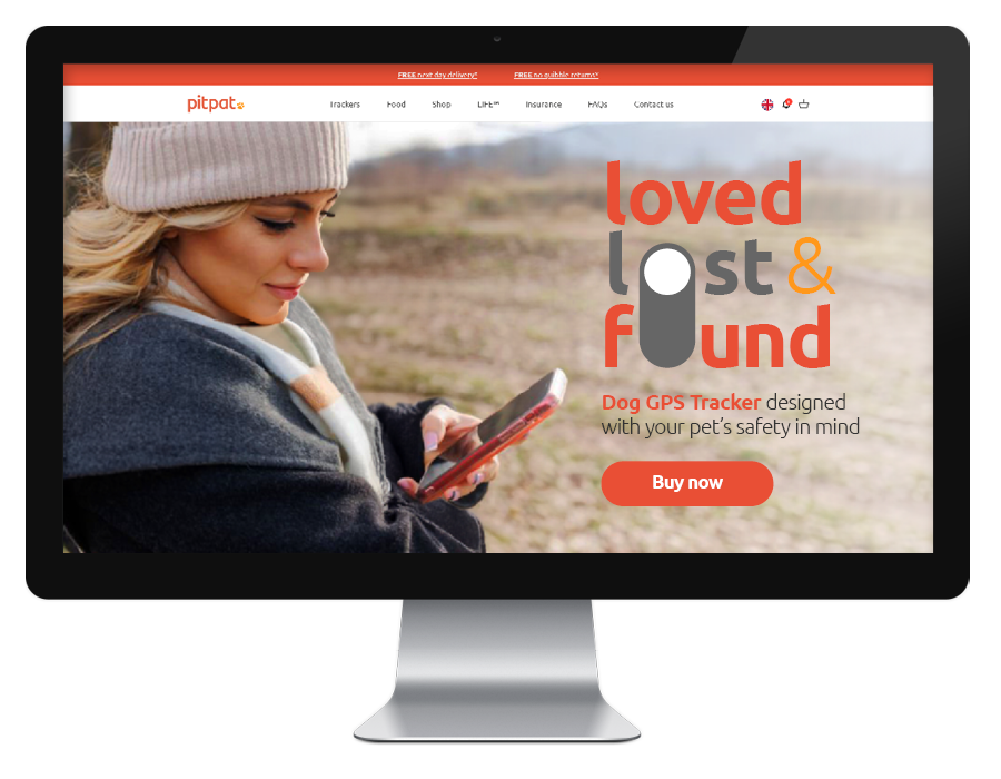
The PitPat brand uses a modern font and simple but bright colour palette of reds, oranges and yellows. This is great because the colour choices command attention.
There’s currently a mixture of natural photography of pets with their owners, and dog cutouts on solid backgrounds.
I have also noticed the use of a cartoon dog at the bottom of every webpage which seems to be feature on the PitPat App, with associated iconography in the same illustrative style.
THE BRAND VOICE
The voice of the brand is friendly, whilst keeping messaging short and sweet. A lot of the webpages use bullet points to clearly describe the product features.
Looking at the PitPat videos, the use of British voiceover makes it clear it’s an English brand, which gives a feeling of being well-established, and that combined with the wording choices (e.g ‘pup’, ‘we got you’), a warm and down-to-earth feeling is applied.
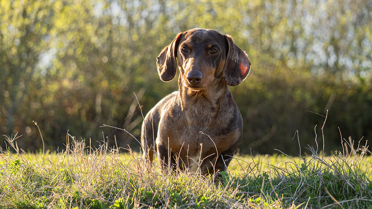
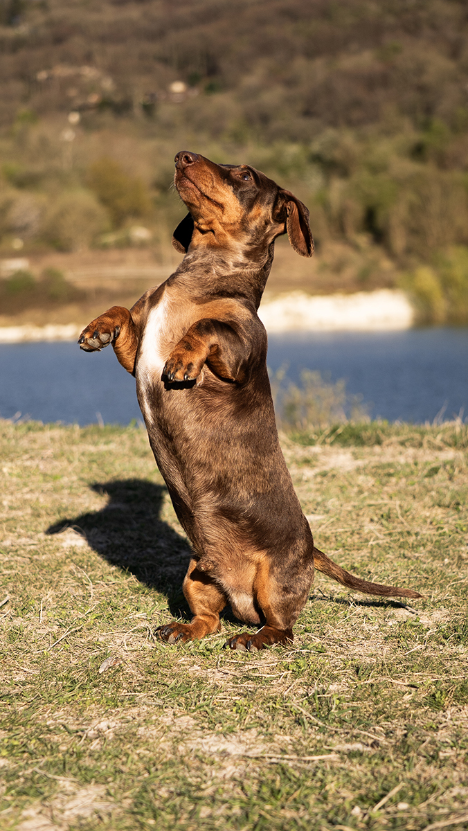
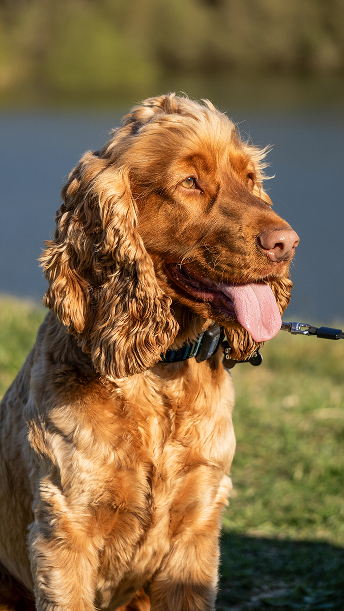
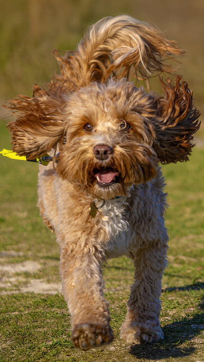
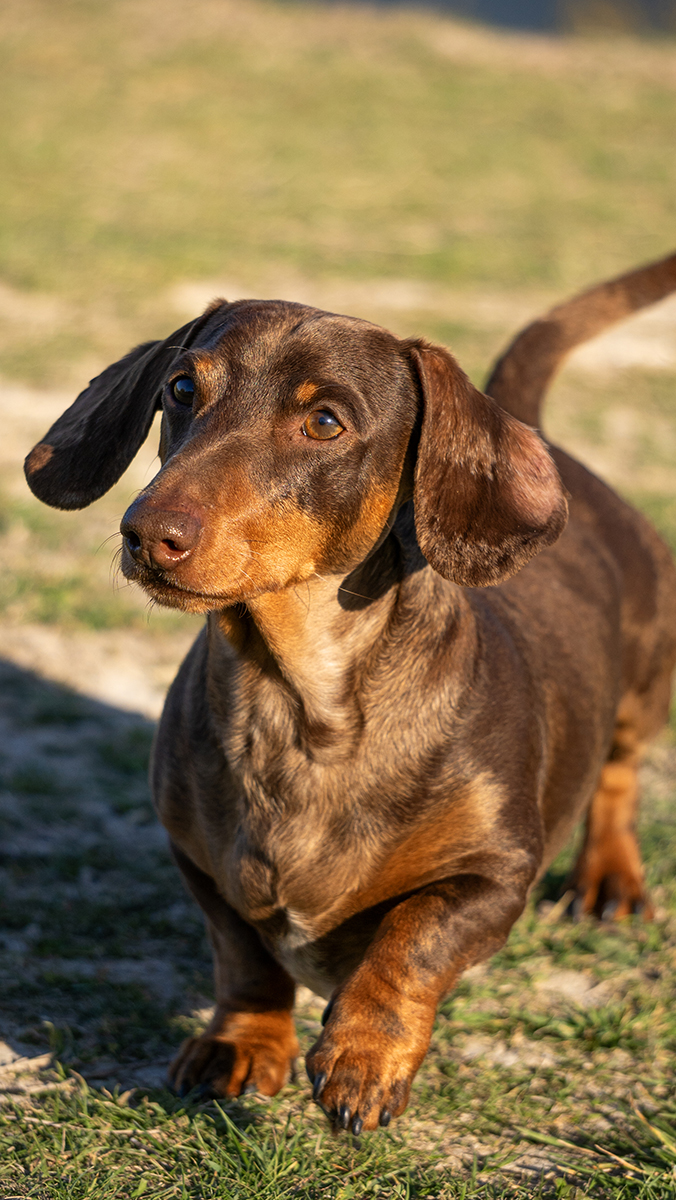
Research: Local Photoshoot
For research, I organised a local dog photoshoot. This opened the door to conversations with dog owners to talk about their experiences where you completely understand the emotional connection they have with their pets: they are part of the family.
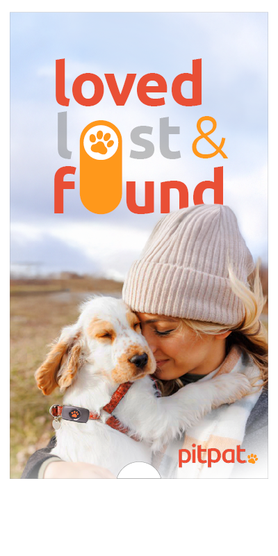
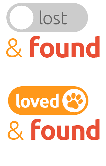
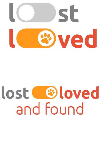
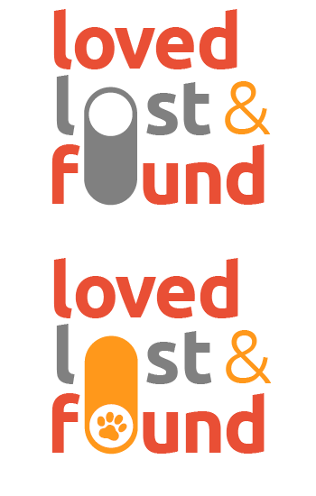
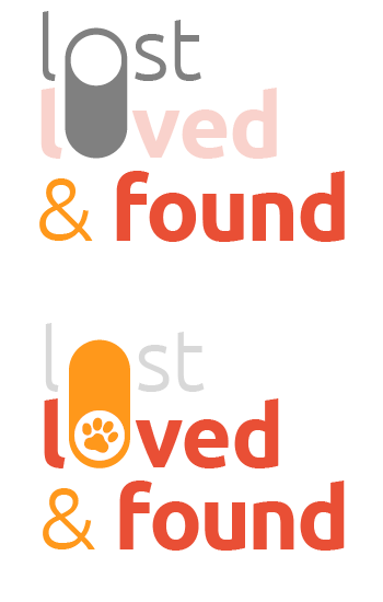
Concept 1: Toggle Button
For the first concept, I thought about the difference in connections. The first being the emotional and loving connection between pet and owner, and then the digital connection between the Tracker and the App. This idea led me to look at different iconic digital items that we use every day, and then my attention was drawn to the toggle button. We’ve all come across them at some point, and we all know how they work.
I loved the notion that if it were a phonecall, you’d slide from left to right to answer the call, so if sliding the switch from ‘lost’ to ‘loved’, you’d be engaging technology in order to connect you with your pet. In order to emphasise the relationship between the dog being ‘loved’ and the product, I made the toggle button when ‘on’ represent the brand; introducing the yellow from the colour palette, and the PitPat paw print from
the logo.
I decided to demonstrate my first campaign concept as the PitPat website homepage header. The tagline would be displayed on top of a full-bleed, slow motion video which shows a woman using her smartphone, then quickly finding her dog – who is wearing the product – jumps into her arms. As she uses her phone and locates her dog, the switch would move from ‘lost’ to ‘found’, with ‘lost’ becoming faded, emphasising the switch between the words. The imagery would remain warm, positive, and emotionally relatable throughout.
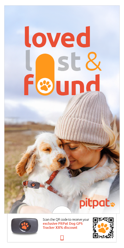
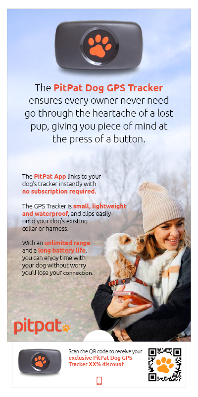
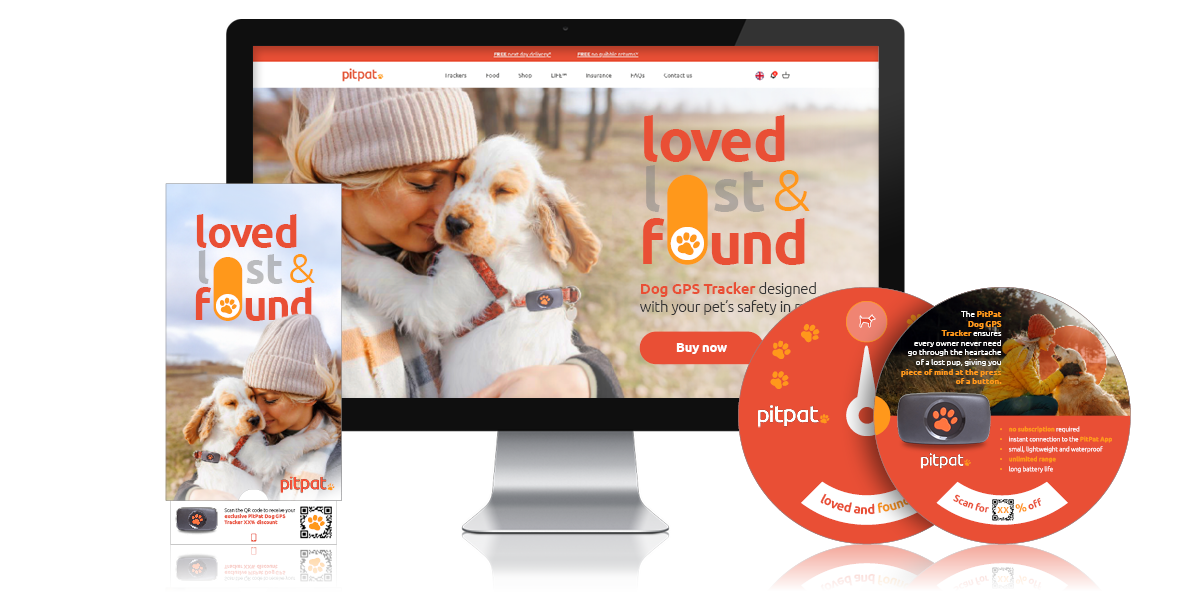
The next challenge was to apply this campaign to a printed item. For this I chose a direct mailer, as I wanted to demonstrate how the toggle button could still be both a design element and a functional piece. When the tab is pulled, not only does the switch move, but the message is revealed, showing a QR code to send customers straight to the website. The reverse has more room for information, where the product features are elaborated on. I have fleshed out the highlights into full paragraphs, but this could easily be converted into bullet points and iconography.
Below are some typographical tests that tried before settling on the final design. I experimented at first with the idea that the ‘lost’ is entirely replaced by ‘found’, and then experimented with different ways the toggle could work as part of the text itself. I then tried the switch vertically, which I believe is still clearly recognisable and shows the switch between words without losing them entirely.
Concept 2: Interactive GPS Reveal
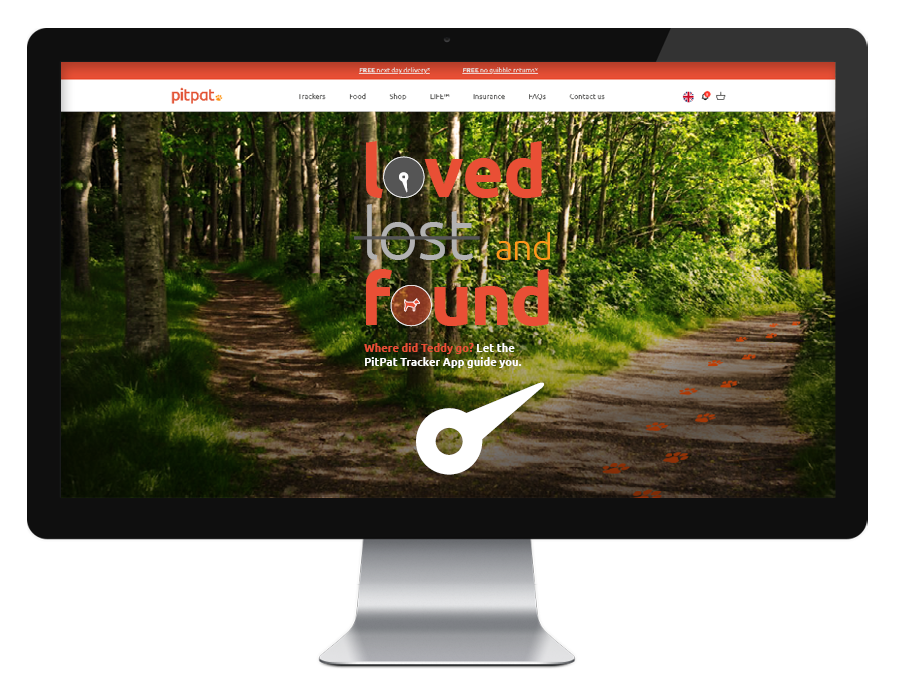
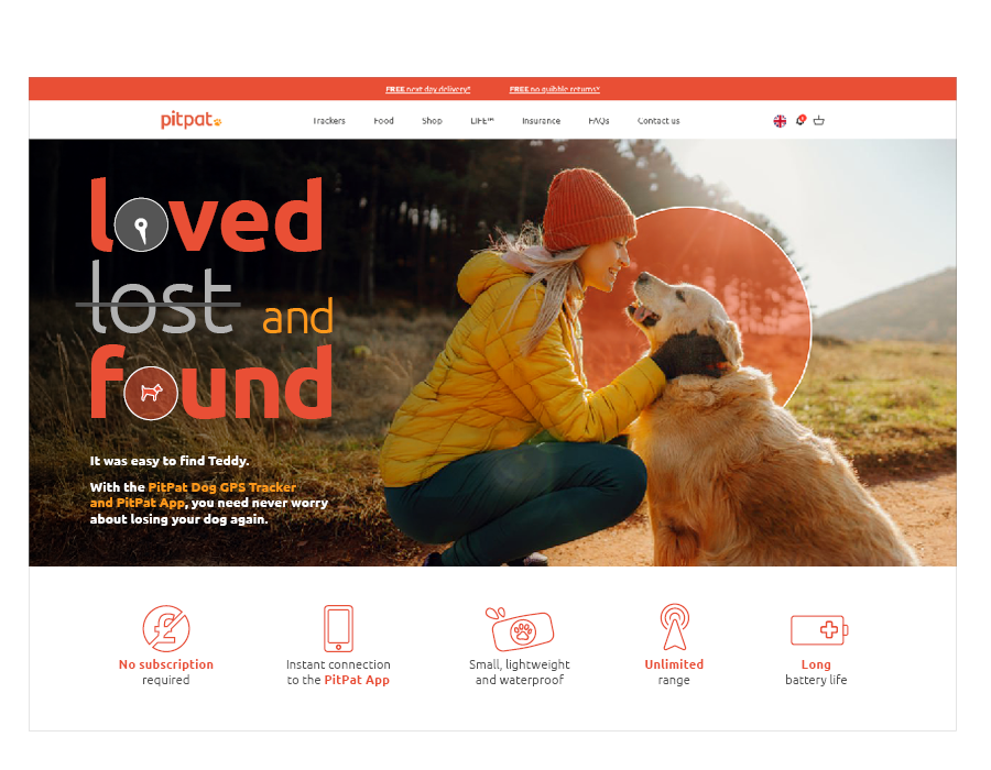
My second concept looks at the same idea of owners using the App to find their dogs, but leans more towards interactivity. The homepage would feature the typographical tagline at the center of the page, on top of an image featuring two paths. The GPS needle would then move to indicate the path the dog has taken, and a link would be clicked by the user to take them to the campaign/landing page which talks more about the product and perhaps offers an exclusive deal.
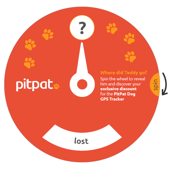
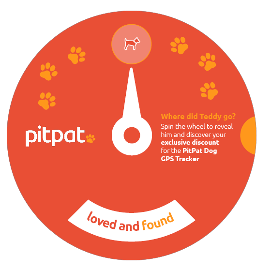
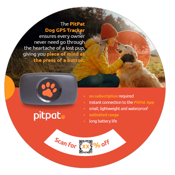
The printed version of this same concept needed to also be interactive, so I created this ‘wheel reveal’. I wanted to try something different with the typography, but the messaging of finding Teddy remains, and you find him by spinning the wheel with the tab at the side until ‘lost’ is replaced by ‘loved and found’ (plus the dog icon at the top – linking neatly back to the icon used in the App).
On the reverse, a QR code has also been revealed, perhaps with the customer’s exclusive discount which is applied when they scan it. The back also has space for a summarisation of the product,
plus the campaign header image, which features the same semi-transparent red circle around the dog, relating again to the App.