Santander Induction Booklet
PRINTED BROCHURE
Role: Designer
Whilst working with Hogarth Worldwide, the opportunity arose to redesign Santander's Induction Booklet.
Their internal branding had been illustrative for a long period and it was time it was modernised into a photographic style to match their external branding.
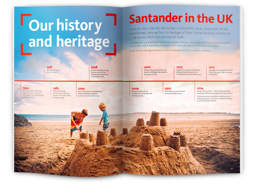
A variety of different design elements were introduced and combined with the photographs, such as red square brackets which would highlight a text area, title or image, pull-out quotes, plus icons to highlight facts and bullet points.
The Design
Each spread was treated with care so that every page turn would be something new and refreshing for the viewer. Predominantly using full-bleed photographs, these were extended and tinted as needed to ensure that they worked alongside the text layout. Although we were branching out into a new subbrand, the Santander guidelines were always respected and followed to ensure consistency.